Brand: Ribena
Studio: Elmwood
Typefaces:
Custom
Prior to the relaunch, Ribena’s brand team embarked on extensive Gemba research, a technique utilised by Japanese parent company Suntory, involving intensive consumer listening and interviews at the earliest stage of product and strategy development to gain a deep understanding of the brand’s DNA. This allowed Ribena to deploy Suntory’s Core Brand Innovation (CBI) process, which involves continual prototyping and testing, putting the consumer at the heart of the design.
Working with Ribena’s brand team and powered by their extensive consumer insights, we were able to rebuild Ribena from the ground up, creating an uplifting visual identity with a warmth and familiarity that reminds us of the taste of home.
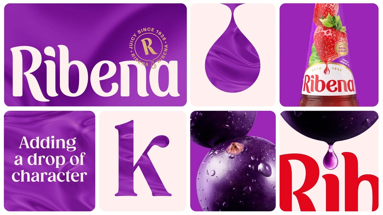
Collaborating with typographer Luke Ritchie, Ribena’s wordmark has been refined, reintroducing a straight baseline and the logo’s signature red, to reflect a sense of pride and trustworthiness. The letterforms are now plumper and juicier, with sharp angles swapped for playful flicks and fluid terminals, bringing back a sense of fun and flavour that’s unmistakably Ribena.
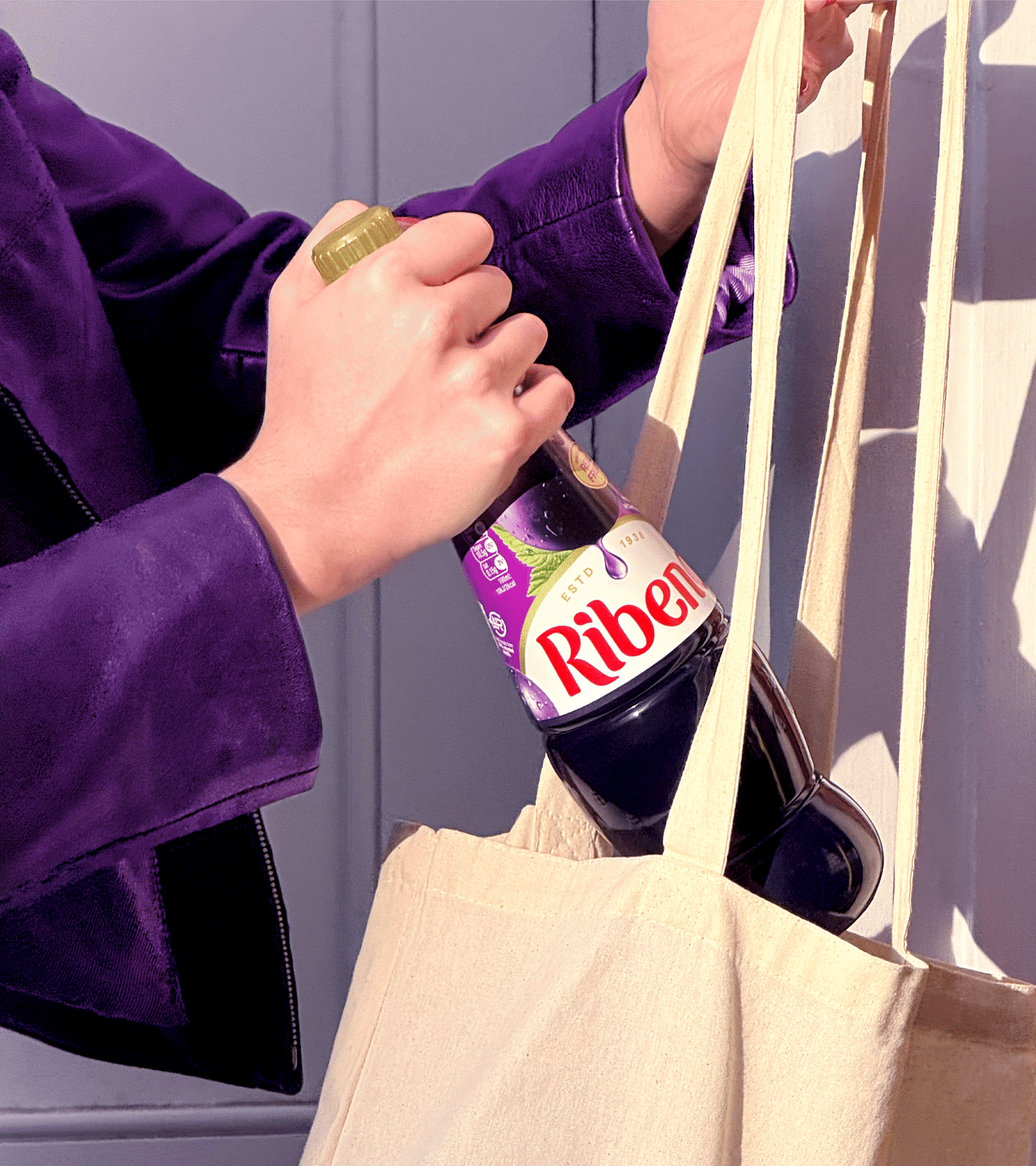
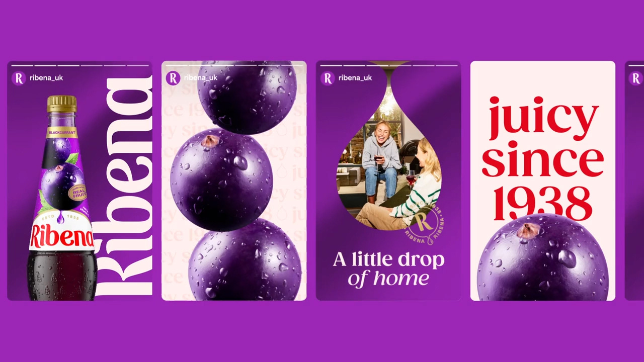
These elements are paired with rich fruit photography that brings to life the full range of flavours, feeding into the logo with a droplet graphic. Acting as a celebration of the fruit at the heart of Ribena’s drinks, these droplets are a window for telling beautiful stories on pack and beyond, a flexible asset that represents Ribena’s unique taste and the memories that it can awaken.
– Elmwood
Logo
Type
Art Direction
Application
Thank you for subscribing to Brand Archive. If you enjoy this then you may also enjoy these resources from the same team:
New! Wittl – Job posting and applicant tracking tool.
LogoArchive Website – Searchable modernist logo archive & research tool.
LogoArchive Shop – Vintage design books & LogoArchive Zines.
BP&O – Contemporary design editorial.
Brand Archive – Research tool for brand designers.


