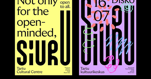
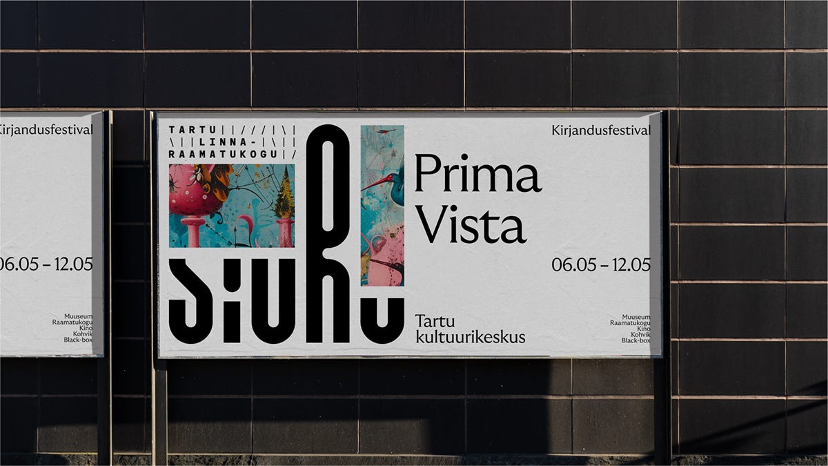
Brand: Siuru – Tartu Cultural Centre
Studio: Bond
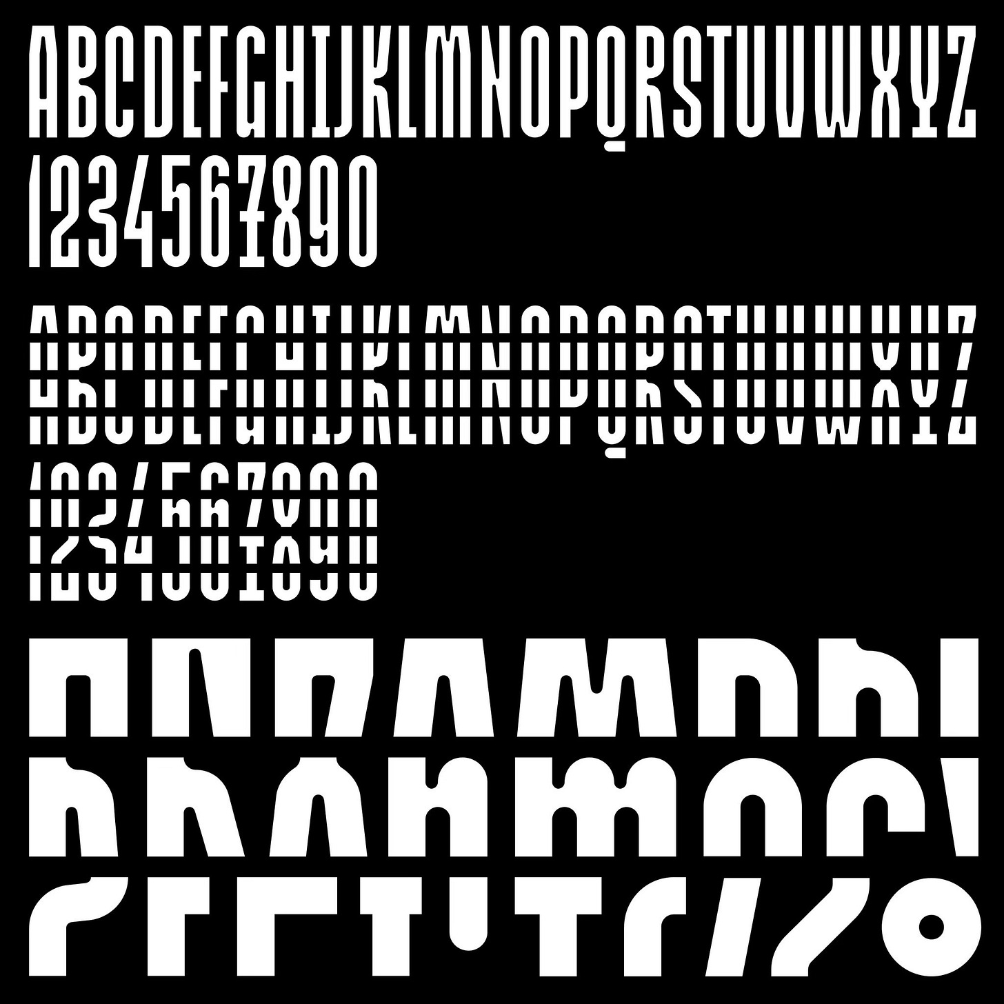
Typefaces:
Newfound Type
GT Ultra Median
Siuru is an art museum—and it’s not an art museum. It’s a library—and it’s not a library. It’s a movie theatre—and it’s not a movie theatre. It’s a cultural centre—and it’s not.
In the same way, Siuru is not a building, nor a logo, nor a name—the word is not the thing, and the map is not the territory. They are merely representations.
This treachery of images and words is an idea that has fuelled philosophers and artists throughout history—and continues to do so.
This applies to Siuru as well. It lies at the heart of Tartu, at the center of its cultural life—but ultimately, it is the people who bring Siuru to life. Those who pass through its pillars give Siuru its true meaning.
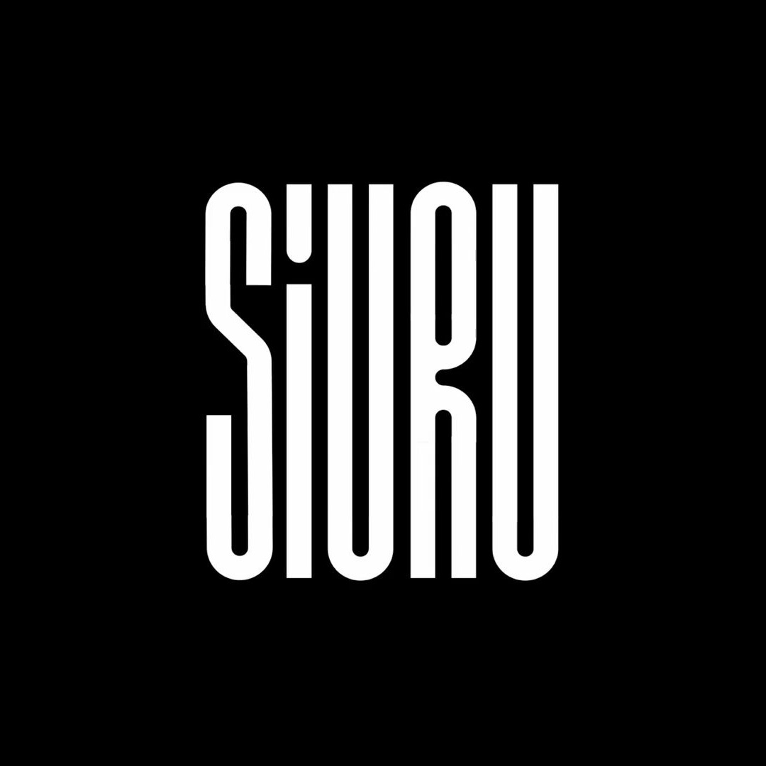
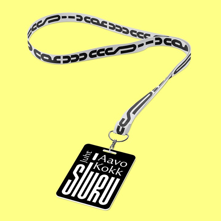
Siuru’s logotype is inspired by its future building—specifically its pillars, modularity, and the visual rhythm of its facade. This concept is embodied through the use of the modular typeface Newfound Type, designed by Estonian type designer Aimur Takk, which is based on the wooden letter collection at the Tartu Printing Museum.
Logo
Type
Icons
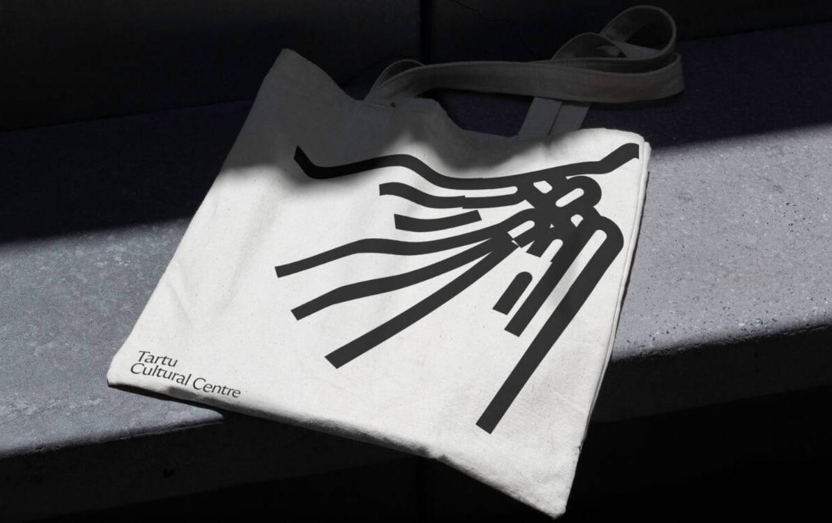
Application

Thank you for subscribing to Brand Archive. If you enjoy this then you may also enjoy these resources from the same team:
New! Wittl – Job posting and applicant tracking tool.
LogoArchive Website – Searchable modernist logo archive & research tool.
LogoArchive Shop – Vintage design books & LogoArchive Zines.
BP&O – Contemporary design editorial.
Brand Archive – Research tool for brand designers.

